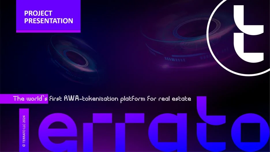
The task
Name the start-up, design its identity and typefaces, and build the investor presentation.
My part
As Director of Marketing and Communications I led a team of four and was responsible for the brand: the name, the identity, the typefaces and the investor deck.
Key decisions
Typefaces of the company’s own rather than stock fonts.
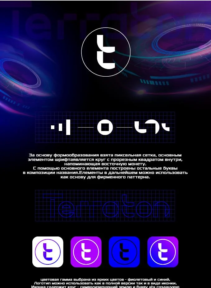
A mark built on a pixel grid: a circle and a cut square, in violet and blue.
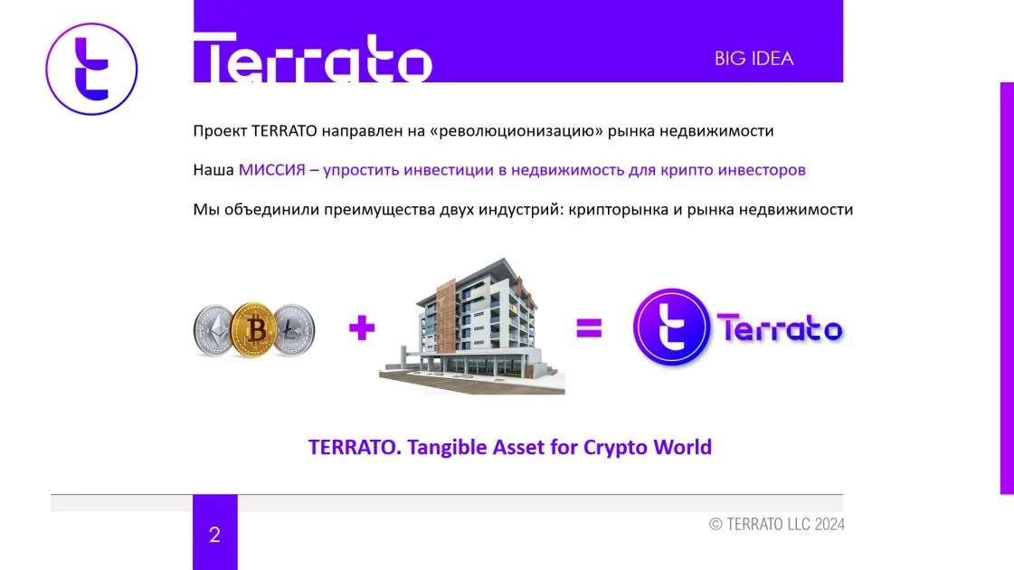
A deck that starts from one equation: crypto plus real estate equals TERRATO, “Tangible Asset for Crypto World”.
How it was done
- Came up with the brand name.
- Designed the logo and the corporate identity: a pixel-grid construction with a circle and a cut square, in violet and blue.
- Created the company’s own typefaces.
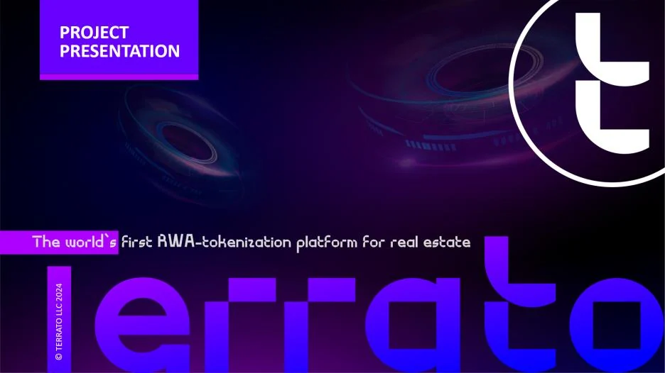
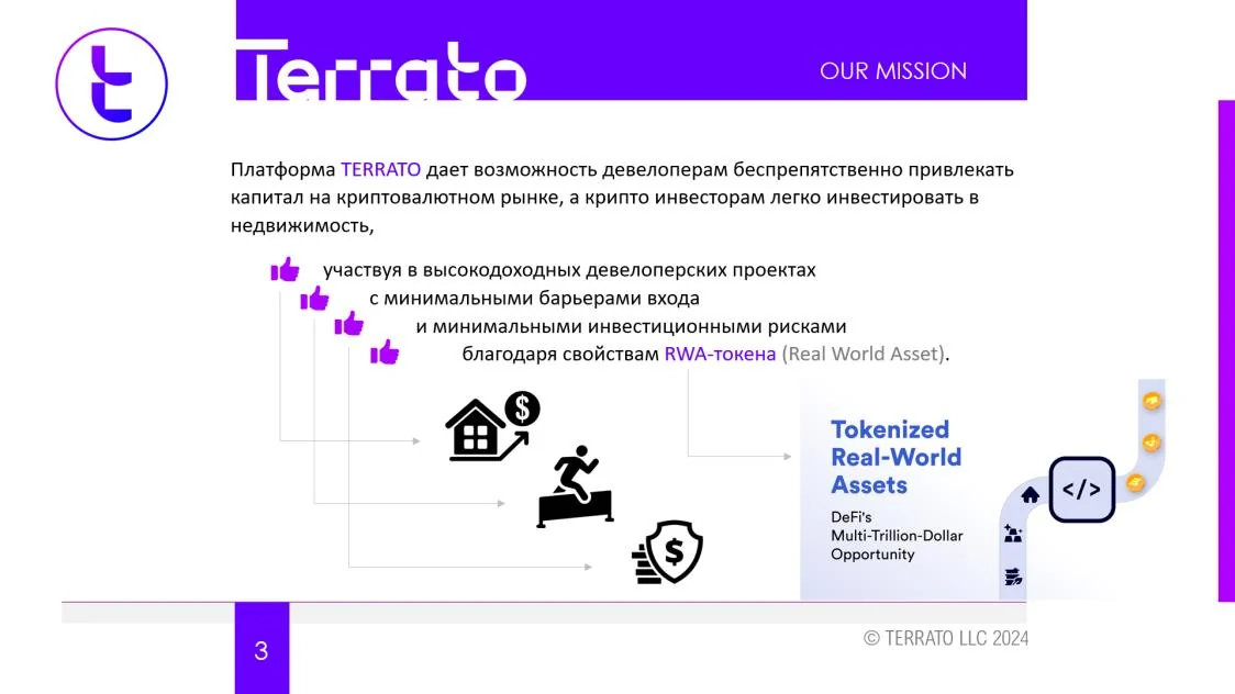
- Built the investor presentation around the big idea, the mission and the platform.
- Led a marketing and communications team of four.
What was delivered
The name, the identity, the typefaces and the investor deck, 2024.